Logo
The CAF logo looks like this. Like all the best corporate logos, it doesn’t play well with others and needs a 50% exclusion zone.
It’s an exercise in negative space. That’s to say that it’s see-through. The central part doesn’t stay white when imposed upon a picture of a green sea.
Colour
This page demonstrates that, for most applications, CAF’s monochrome ensemble will suffice.
#000 Black
#fff White
For high days, holidays and top level design decisions, brighter colours join the fray. Right now, these are blue and yellow.
#002554 Pantone 655 C (Blue)
#ffcd00 Pantone 116 C (Yellow)
Type
CAF uses two typefaces: Libre Franklin for paragraphs and headings, Della Respira for occasional bylines and subheadings.
Both of these are available on the Open Font License, which means that you are free to download and use them.
Credit: Pablo Impallari, Rodrigo Fuenzalida and Nhung Nguyen
Credit: Nathan Willis
CAF text should be left aligned and kerned normally. Stretched tracking in lowercase text is a dreadful look.
Please note that Della Respira has only one weight and no italics. Some software will silently generate unattractive faux bold and oblique letterforms. Do not use these.
Commercial Alternatives
When printing justified paragraphs at small point sizes – for example in an event programme, brochure or magazine article – our screen-optimised free fonts aren’t so great. Expensive commercial typefaces (ITC Franklin Gothic and ITC Souvenir) are the answer. These are both bundled with Adobe software, so if you’re equipped enough to need them, you already have them.
To give some vague impression consistency, don’t use ITC Franklin Gothic for big headlines. Stick with Libre Franklin, since we don’t need the other’s better print behaviour.
Images
CAF has a small library of images that are either free use or pre-cleared for use. Fill your boots.
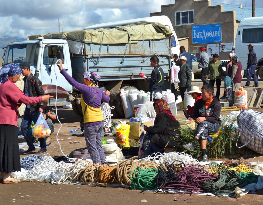
Rope market at a village in Kyrgyzstan. 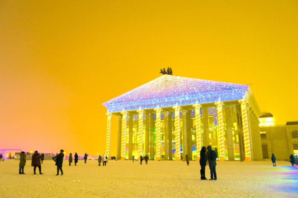
The Kazakhstan State Opera and Ballet Theatre, known as Astana Opera, which opened in 2013. 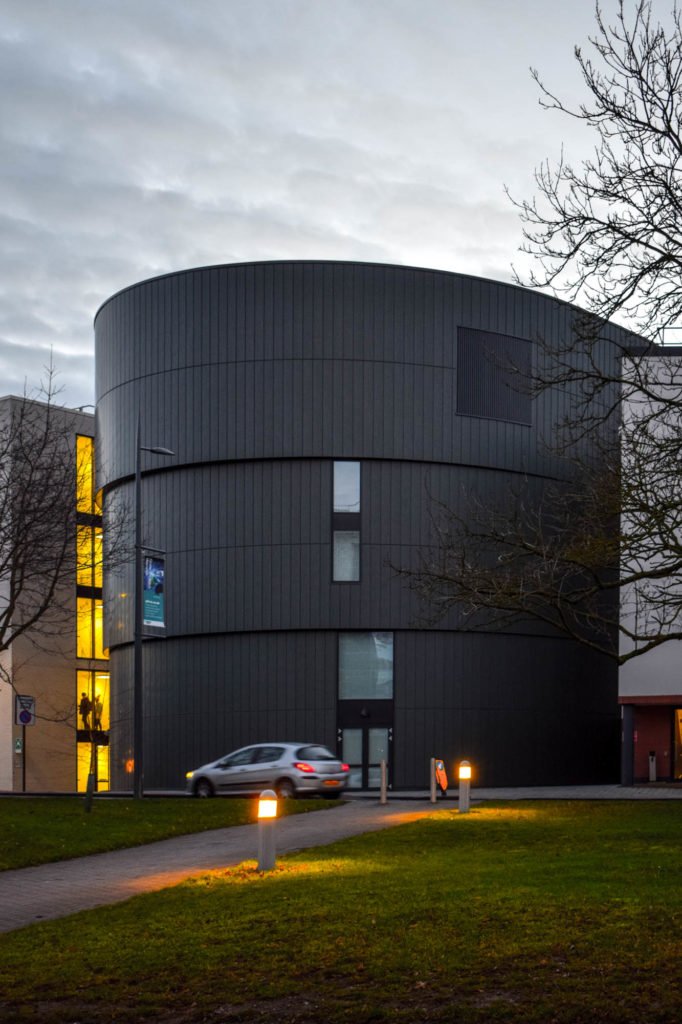
Architectural photograph of a recent building at WBS, University of Warwick. © Will Kerry 2017. All rights reserved. 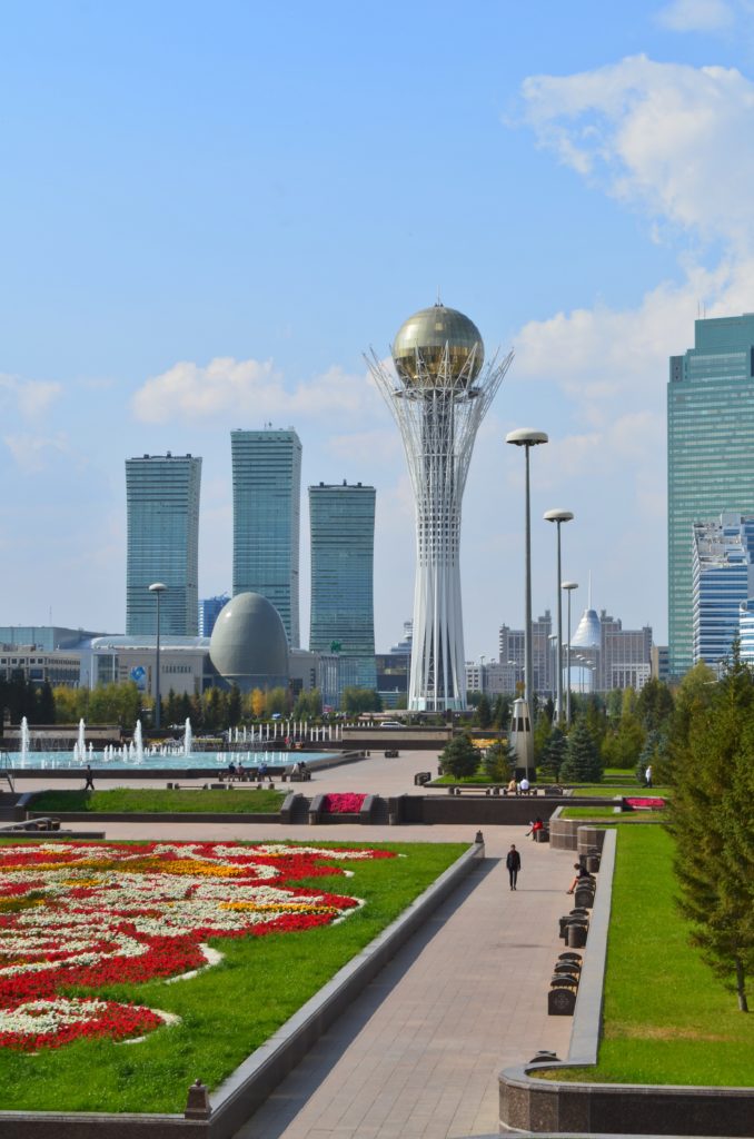
The skyline of Astana in 2014, as seen from the gardens behind the Presidential Palace. The foreground buildings, from left to right, are the three Northern Lights Towers, the egg-shaped National Archives, the Bayterek Tower, and Emerald Towers 1, the tallest building in Kazakhstan. Norman Foster’s cone-shaped Khan Shatyr (Royal Marrquee) is visible in the distance. 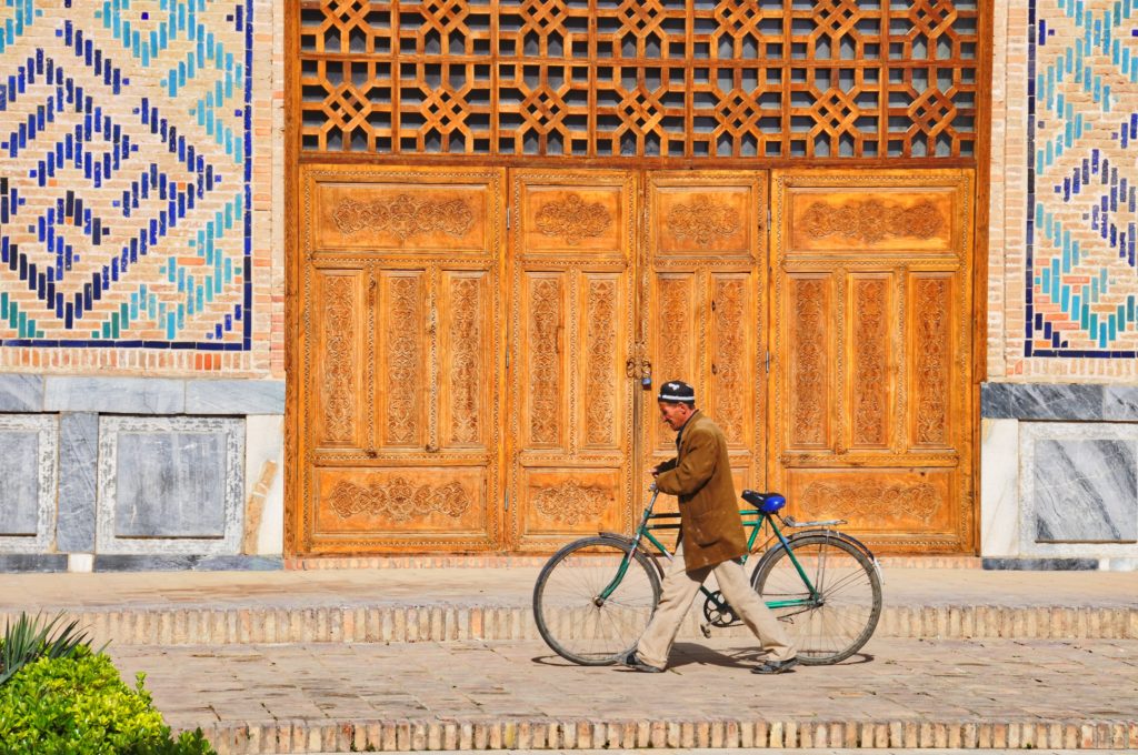
A man pushes his internationally-ubiquitous ‘Phoenix’ bicycle past the entrance to the Kok Gumbaz Mosque, Shahrisabz, Uzbekistan. 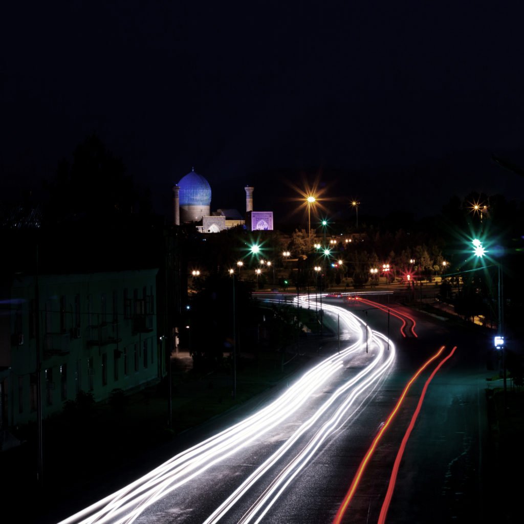
Passing traffic leaves its trail in light upon film when it snakes between the junctions beneath the blue cupola of Samarkand’s Bibi-Khanym Mosque. 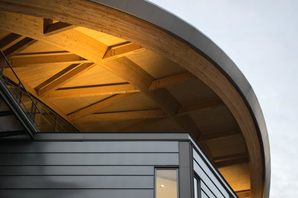
Laminated timber and since-plating are softly up-lit at the University of Warwick’s new Oculus building. 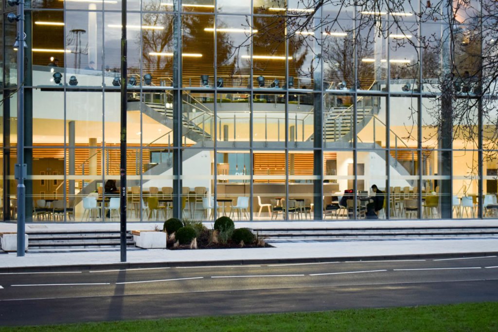
A single student works into the evening at the University of Warwick’s state-of-the-art Oculus building, completed 2017. 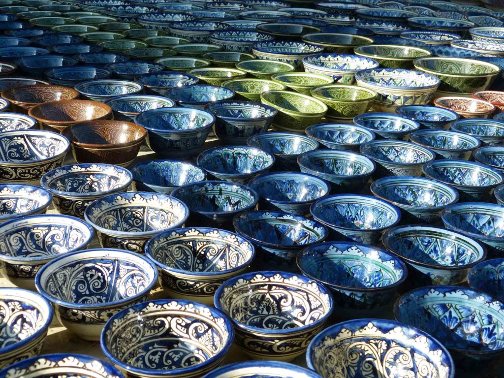
A display of piyola — handleless tea cups — for sale in Uzbekistan. 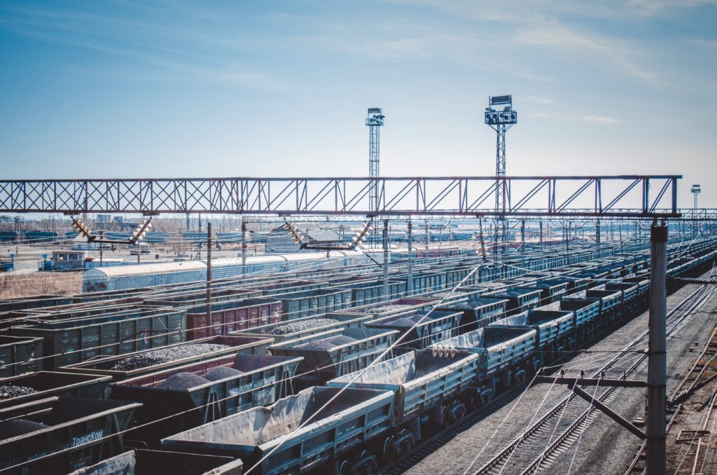
Aggregate trains in Kazakhstan. 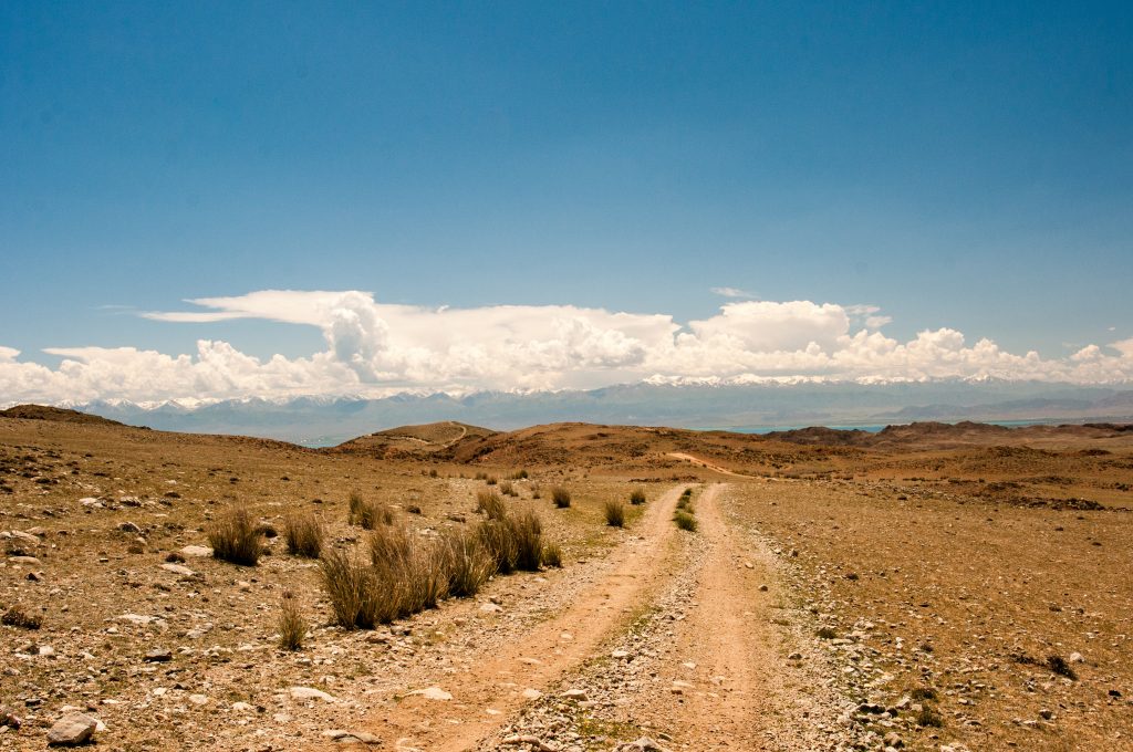
A track leads to Issyk-Kul, a Kyrgyz landmark and endorheic lake, which sits beneath the Tian Shan mountain range. 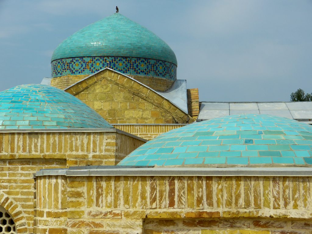
Some of the many turquoise cupolas in the necropolis at Kokand. 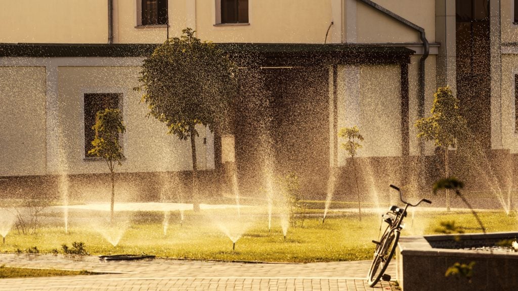
Sprinklers water the lawns in a Samarkand courtyard. 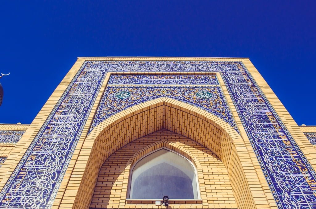
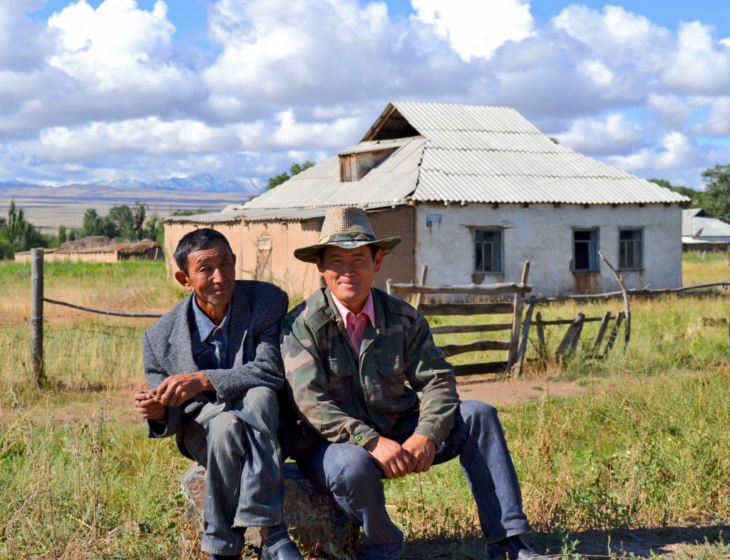
Farmers in Kyrgyzstan share a rock.
‘I want to make a special share image for my favourite social media platform’
Stop right there. Don’t do that. Use one of these instead.
Closing thoughts
CAF needs good typography. If you haven’t already, read Butterick.
The postmodernist is not concerned with consistency. The designer very much is. Do as I say. Thank you.
Design and development by Will.